Modern Interior Gallery Walls | The Visual Chaos Myth
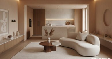
In 2026, Modern Interior Gallery Walls serve as the heart of personalized home decor. They allow you to tell a story through photography, art, and memorabilia. When done correctly, they add depth and character to a minimalist space. However, a psychological reality remains: the human brain seeks patterns, not clutter. Most homeowners overcrowd their walls with mismatched frames and inconsistent spacing. If you don’t master the “Anchor Point” and “Negative Space,” your gallery will look like a cluttered attic rather than a curated collection.
The “Overcrowding” Sensory Overload
The biggest mistake in contemporary lounge layouts involves trying to fill every square inch of a wall.
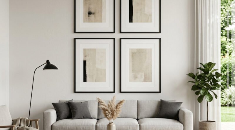
I recently consulted for a client who had hung 45 small frames on a single living room wall. Instead of looking “artistic,” the room felt claustrophobic and busy. The Lesson: White space (or negative space) is just as important as the art itself. According to The Art Institute of Chicago curation standards, art needs “room to breathe” to be appreciated. For successful Modern Interior Gallery Walls, limit your collection to a few meaningful pieces rather than a sea of small, distracting frames.
The Failure of Inconsistent Spacing
In 2026, we see many “DIY” galleries where the distance between frames varies wildly.
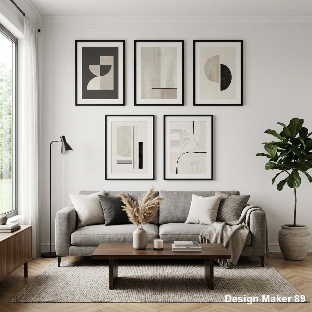
I’ve seen dozens of walls where some frames touch each other while others sit 10 inches apart. This inconsistency creates a sense of “visual instability” that bothers the subconscious mind. The Fix: Use a consistent “Gap Rule.” Whether you choose 2 inches or 3 inches, maintain that exact spacing between every single frame. Professionals use laser levels and paper templates to ensure precision. High-quality Modern Interior Gallery Walls require mathematical symmetry, even in an “eclectic” arrangement.
Why “Scale” Destroys Interior Wall Harmony
Manufacturers sell “Gallery Wall Kits” with tiny 4×6 frames, but these rarely work on a large living room wall.
I once assisted a homeowner who used small frames on a massive 5-meter wall. The art looked “lost” and insignificant, like postage stamps on a billboard. The Advice: Scale your art to your furniture. A gallery should generally span 60% to 75% of the width of the sofa or sideboard below it. If the frames are too small, they create “Visual Weakness.” For expert tutorials on spatial proportions, refer to Architectural Digest design guides.
The “Mismatched Style” Color Trap
Many Modern Interior Gallery Walls fail because they mix too many wood tones, metal finishes, and art styles without a “Common Thread.”
I’ve seen walls that combined neon pop art with vintage black-and-white family photos in gold, black, and oak frames. The result was a headache, not a highlight. The Pro Tip: Choose one unifying element. It could be “All Black Frames,” “All Monochrome Photography,” or a “Specific Color Palette.” This “Anchor” allows you to vary the sizes and shapes while keeping the wall cohesive. In the world of Interior Design, unity creates luxury.
The Professional “Centerline” Strategy
Installing Modern Interior Gallery Walls usually results in frames being hung too high or too low.
The Strategy: Always aim for the “Eye Level” rule—roughly 57 to 60 inches (145-152cm) from the floor to the center of the gallery. Professionals start with the largest “Anchor Piece” in the middle and build outward. If you hang your gallery near the ceiling, you disconnect the art from the room’s seating area. True Modern Interior Gallery Walls must feel integrated with the furniture, not floating in isolation.
Why Trust Design Maker 89?
At Design Maker 89, we believe that “Less is often More.” Our interior stylists combine art history knowledge with spatial psychology to create environments that soothe the soul. We know that in 2026, the home should be a sanctuary from digital noise. We test layout software, frame durability, and lighting angles to ensure your art looks its best. Our mission empowers you to create Modern Interior Gallery Walls that reflect your life without cluttering your mind.
read more about
Floating Shelf Stability | The Structural Disaster
Modern Living Room Design Ideas | The Hardwood Look-Alike Scam
The Zero-VOC Paint Scam | Are You Still Breathing Toxic Fumes?
The Gray Prison | Why Your “Minimalist” Living Room Is Making You Sad
The Anti-Fog Mirror Myth | Why Your Shower View is Still Blurry
The Electric Fireplace Scam | Luxury Ambiance or Expensive Light Show?