Living Room Ideas | Why Accent Walls Make Rooms Smaller
Living Room Ideas | The Accent Wall Fallacy: Why It Makes Your Room Look Smaller
In 2026, Living Room Ideas heavily feature open layouts and seamless transitions. Yet, many homeowners still rely on the traditional “Accent Wall”—painting a single wall a bold navy, forest green, or charcoal while leaving the rest neutral. People think this trick injects instant personality and creates an illusion of depth. However, a psychological and visual reality remains: chopping up your vertical surfaces destroys the room’s cohesive flow. If you don’t understand how contrast affects human depth perception, your accent wall will actually pull the boundaries inward, making your living area feel cramped and visually noisy.
The “Visual Stop” Depth Failure
The biggest mistake in modern color application involves using dark paint to create depth without considering line continuity. Light travels and reflects off surfaces to signal spatial volume to our brains.
I recently consulted for a client who had painted their back living room wall a deep, dramatic black. Instead of making the room feel endless, the dark wall acted as a solid “Visual Stop” that brought the back of the room aggressively forward. The Lesson: Saturated colors absorb light rather than reflecting it. According to design principles supported by The Architectural Review, a sudden shift in wall color highlights the exact boundaries of the space. For successful Living Room Ideas, you must maintain color continuity. If you want a bold color, commit to painting the entire room to dissolve the corners, rather than framing just one side.
The “Featureless Feature” Design Blunder
In 2026, we see many interiors where an accent wall serves no architectural purpose. Homeowners simply pick a random flat wall, paint it a bright color, and push a television or sofa against it.
I’ve seen dozens of spaces where the accent wall highlighted a radiator, an ugly air conditioning unit, or a chaotic pile of electronic cables. The Fix: An accent wall should only exist to frame an existing architectural feature, such as a stone fireplace or a historic arched alcove. High-quality Living Room Ideas dictate that if the wall doesn’t have a structural point of interest, forcing a color onto it creates a “featureless feature” that confuses the eye. If there is nothing to celebrate on that wall, keep the paint uniform.
Why “Contrast Fatigue” Ruins Your Comfort
A common mistake in contemporary decoration is ignoring the daily psychological impact of high-contrast living spaces.
My Personal Experience: I once lived in an apartment with a bright teal accent wall behind my desk. Within three months, I developed chronic eye strain and felt constantly restless. When I repainted the entire room a soft, cohesive beige, my focus returned immediately. The Advice: Severe contrast forces your iris to constantly adjust as your eyes scan the room. For expert guidance on color psychology and human wellness in spaces, refer to The American Society of Interior Designers (ASID). Your living room should promote relaxation, not visual gymnastics.
The “Unbalanced Proportion” Layout Trap
An accent wall draws 90% of the attention, leaving the rest of the room looking empty, neglected, and structurally lopsided.
I’ve seen stunning, expensive furniture completely ignored because a bright orange wall dominated the entire space. The Pro Tip: Follow the “60-30-10” color rule. Use 60% of a dominant color for the walls and ceiling, 30% of a secondary texture for furniture and textiles, and only 10% for an accent color distributed throughout the room via small accessories like pillows, art, or vases. In the world of Living Room Ideas, distribution beats isolation every single time.
The “Dated Social Media Trend” Reality
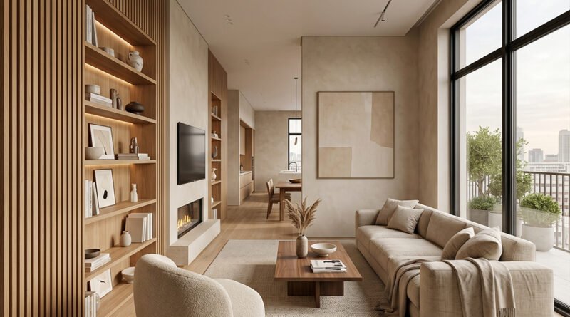
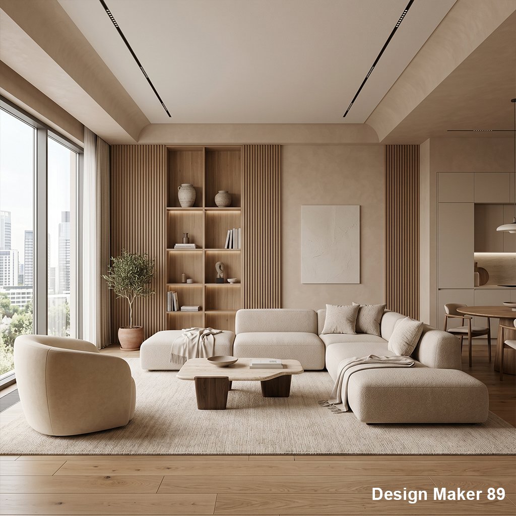
The single painted accent wall is an artifact of the early 2000s that was revived by fast-paced video platforms. In 2026, true sophistication relies on texture, architectural molding, and monochromatic layers.
The Strategy: Instead of reaching for a paintbrush, create an accent using “Dimension.” Install floor-to-ceiling wooden slats, subtle plaster textures, or uniform built-in shelving that matches the wall color. This introduces sophistication without breaking the room’s visual volume. True Living Room Ideas mastery means creating spaces that feel complete, tranquil, and expensive.
Why Trust Design Maker 89?
At Design Maker 89, we believe that “A Space Should Feel Whole.” Our interior specialists combine color theory with optical physics to evaluate how layouts impact your mood and perception. We know that in 2026, quick-fix trends often ruin the long-term enjoyment of your home. We test paint finishes, track visual movement patterns, and design for real human comfort. Our mission empowers you to implement Living Room Ideas that maximize your space, elevate your style, and create lasting harmony.
read more about
Kitchen Remodeling | Why Open Shelving Is A Disaster
Modern Interior Gallery Walls | The Visual Chaos Myth
Floating Shelf Stability | The Structural Disaster
Modern Living Room Design Ideas | The Hardwood Look-Alike Scam
The Zero-VOC Paint Scam | Are You Still Breathing Toxic Fumes?
The Gray Prison | Why Your “Minimalist” Living Room Is Making You Sad
The Anti-Fog Mirror Myth | Why Your Shower View is Still Blurry
The Electric Fireplace Scam | Luxury Ambiance or Expensive Light Show?